Moody Blues – a lesson in a simple blended seascape
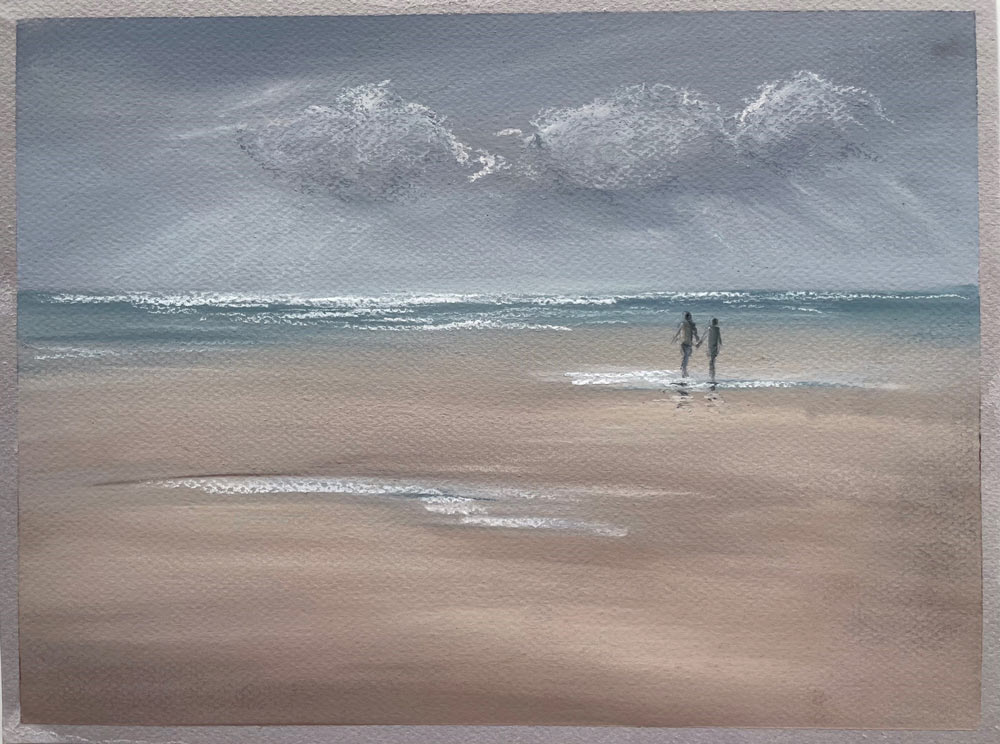
This is a simple video introducing blending with fingers as well as some blending of pastel on pastel, using a limited grey and blue palette with some sandy tones to create a moody scene.
Material and Tips
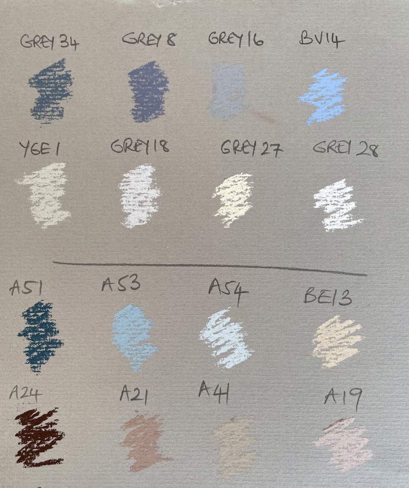
- This demonstration uses Canson Mi-Teintes textured paper A4 size. I chose a cool grey tone. This is affordable paper, great for soft blending and comes in blocks or individual sheets in a large range of tones.
- I use the honeycombed textured side of the paper – that gives a nice tooth to allow several layers of pastel pigment to be built up.
- Don’t worry if you do not have every exact colour from the pastel colour chart, you can improvise and create your own blends.
- In addition to the Unison Colour pastels indicated on my colour chart, I use a charcoal pencil for adding the distant figures. A dark pastel pencil could also be used instead. And a white pastel pencil adds the end highlights on the figures.
- When drawing in the small figures I have a small piece of plastic to rest my hand on and to ensure you don’t disturb the rest of the painting.
- I tape my paper to a tilted drawing table, this helps some excess pastel dust fall down. From time to time you may need to tap the table/board or lightly blow away any dust build up (ensuring it is not near your cup of tea!)
- Keep kitchen paper, a cloth or baby wipes at hand to keep fingers clean to avoid muddy blending
- Assess your progress by standing back every so often to gauge if some areas need more work
- You can always add more detail or definition and tweak as you go along
- The most important thing is to relax and enjoy the process. Frequent breaks help you see how your colours and marks are balanced
HAVE FUN !!!!!!
RESTRICTED CONTENT