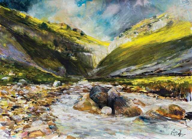
Acrylic ink, Watercolour, Gouache and Unison Colour pastels on ‘Hot Pressed’ 300gsm (140lb)
Canson Moulin du Roy watercolour paper. 30 x 22 inches (76 x 56cm)
Getting the feel for how water moves, cascades, flows through the landscape and sparkles and shimmers eludes many artists – both professional and student. In this article I will show you how, through technique combined with observation and a feel for subject, your paintings can be successful too.
The skill is to express movement, flow, light and rhythm in water is to allow your creative marks to echo these attributes. Overthinking the subject or applying too many marks through lack of confidence leads to overworked and heavy paintings than the desired sensuality of the water in particular which is desired.
Many artists overplay their hand and try too hard to make the water look like it’s moving by adding more and more layering. This seldom works. The principal of ‘less is more’ can be our guide. Adding those little extra marks again and again to make the water look better, brighter and to have more flow seldom convinces either you the artist or the viewer that it looks and ‘feels’ right.
RESTRICTED CONTENT